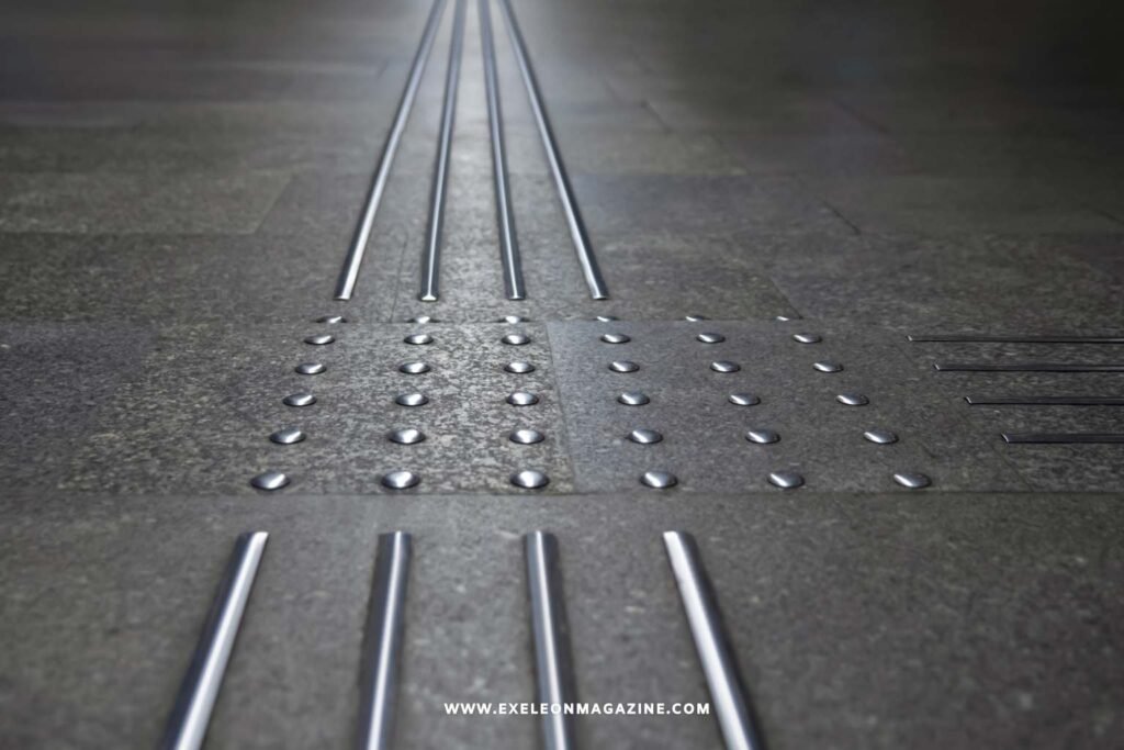
Picture the edge of a train platform. Just before the drop, the floor changes. You feel raised dots under your shoes, and you slow down without really thinking about it. Those bumps and bars help people who are blind or have low vision detect a hazard or find their way when other cues are missing.
If you manage a shop, clinic, community centre, transport area, or any public site, you have probably seen these patterns near stairs, ramps, and doorways. This guide explains what they do, where they belong, and when a metal option such as stainless steel is worth considering. It keeps the standards talk practical, but you should still confirm site details with an accredited access consultant or local authority.
What the raised dots and lines do
The proper name for these patterns is tactile ground surface indicators, often shortened to TGSIs. They come in two main types, and the shape tells you the purpose.
Warning indicators: round domes that signal a hazard
Warning indicators are truncated domes: rounded studs built into or applied onto a walking surface. They tell a person to stop, check their surroundings, and take care before moving on. National Construction Code guidance on D4D9 links warning TGSIs to hazards such as stairs, escalators, ramps, and some low overhead obstructions below 2 metres. In some aged-care buildings, raised dome buttons on handrails may be permitted as an alternative to floor indicators.
Directional indicators: bars that guide movement
Directional indicators are raised bars or grooves that give orientation. They can guide a person along a safe route, away from a hazard, or across an open space such as a foyer where there is no wall, kerb, or other edge to follow. Think of them as a tactile path to a counter, doorway, lift, or other key point.
Where they belong, and where they don’t
The goal is to place indicators where they genuinely help, not to cover a site with extra texture. The NCC D4D9 guidance focuses warning indicators on real hazards, while technical details for TGSIs are set out in AS/NZS 1428.4.1. Public transport settings can add requirements under the Disability Standards for Accessible Public Transport, including warning indicators at railway platform edges and a clear access path between indicators and other structures.
If you are also thinking about how people move through wider public facilities, a modern development overview can add useful context.
One caution is worth repeating: more is not always better. Too many indicators can confuse pedestrians and make movement harder for people using mobility aids. Keep placement purposeful, and maintain indicators so dirt or wear does not undermine the original installation.
The materials cheat-sheet, with a spotlight on stainless steel
Tactile indicators come in several materials, each with trade-offs.
- Stainless steel studs and bars: hard-wearing, corrosion resistant, and visually understated.
- Rubber, polyurethane, or FRP tiles: often lower cost and quick to lay, though wear varies by product and site conditions.
- Porcelain or ceramic: durable and clean-looking, and common in built-in tile systems.
- Integrated versus discrete: integrated tiles are single panels, while discrete studs or bars are fixed individually into the surface.
Stainless steel tactile indicators suit places where durability and appearance both matter, such as entrances, transport hubs, commercial buildings, and high-traffic walkways. Stainless steel resists corrosion, handles frequent foot traffic, and can keep a tidy look over time. The catch is contrast. The metal still has to stand out clearly from the surrounding floor, so colour and reflectance matter as much as the choice of stud or bar.
If you prefer a durable, low-maintenance metal option, you can review stainless steel tactile indicators from an Australian supplier for examples of finishes and insert styles such as rubber or carborundum. Treat product pages as a starting point, then confirm specifications, contrast, fixing method, and compliance needs for your project.
Make it work on your site: contrast, width, and setback
The single most overlooked factor is luminance contrast, meaning how clearly the indicator stands out from the floor around it. Some Australian guidance measures contrast under AS/NZS 1428.4.1 Appendix E and uses different minimums, such as 30 percent for integrated tiles, 45 percent for discrete single-colour studs, and 60 percent for composite discrete studs. The result depends on the actual floor, so do not rely on a brochure image. Test the real surface, including wet and dry conditions where relevant.
Stainless steel tactile indicators can perform well, but only when the chosen finish contrasts with the substrate. A bright metal stud on a pale tile may not be clear enough, while the same product on a darker surface may be easier to detect.
A few placement points to discuss with a consultant include:
- Warning pads are commonly 600 to 800 mm deep, with a setback of about 290 to 310 mm from the hazard.
- Directional runs are often 600 mm wide and may narrow to about 300 mm between warning pads.
- Transport areas, stairs, ramps, and building entries may each have different requirements, so check current rules before installation.
Document the decisions and photograph the finished installation. Those records make future audits, maintenance checks, and surface changes easier to manage.
Install and care basics
There are two common ways to fit indicators. Cast-in or built-in tiles are set into the surface and often suit new work. Drill-and-fix studs or bars are mechanically fixed into an existing surface, which can suit retrofits. Mechanical fixing helps indicators stay secure under regular traffic.
Care is simple, but easy to overlook. Clean indicators so grime does not dull contrast or fill the texture. Check for loose, damaged, or missing studs and bars. Re-test contrast after resurfacing, repainting, or replacing nearby flooring, because a fresh coating can remove the contrast the design relied on. Planned upkeep is part of practical design choices in accessible public spaces.
Common mistakes to avoid
- Choosing indicators with too little luminance contrast, so the pattern blends into the floor.
- Placing pads at the wrong distance from a hazard.
- Using floor pads where a permitted handrail button alternative is more suitable.
- Forgetting clear path requirements near platform edges in transport settings.
- Installing so many indicators that they disorient the people they are meant to help.
- Changing the surrounding surface later without re-checking contrast
Conclusion
Tactile indicators are small details with an important safety and wayfinding role. When the type, contrast, placement, and maintenance are right, they help people move through a space with more confidence. A stainless metal option can be sensible where durability and a clean appearance both matter, but the surrounding surface, local rules, and real contrast result decide what works. Before you buy or install anything, check the current codes and speak with an accredited access consultant or local authority. A short conversation early can prevent costly rework later.
FAQs
What is the difference between warning and directional indicators?
Warning indicators are round domes that signal a hazard. Directional indicators are bars that guide a person along a route or across open space when there is no wall or kerb to follow.
Do all sites need the same layout?
No. Hazards, surfaces, traffic, and local rules should guide each layout.
Can metal indicators be used outdoors?
Often, yes, but exposure, cleaning, drainage, and contrast still need checking.
Who should confirm the final details?
Use an accredited access consultant or local authority before ordering or installing.