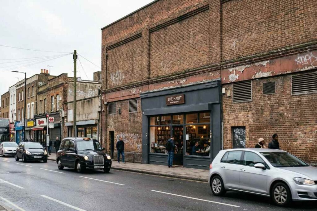
Walk past enough strip malls and you start to notice a pattern. There’s always one business — a new restaurant, a tax office, a boutique gym — whose wrong sign size looks fine from twenty feet away in a photo but is essentially invisible from the road. The cost font is readable. The colors are correct. But the whole thing is maybe eighteen inches wide on a forty-foot facade, and passing drivers have already gone a block before their brain even registered that something was there.
Nobody made a bad-looking sign. They just made one too small to work.
The Gap Between the Screen and the Street
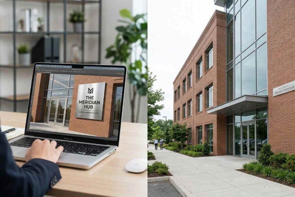
Most business owners see their sign design for the first time on a laptop. And on a laptop, a well-proportioned mockup looks crisp, balanced, legible. The problem is that a thirteen-inch screen compresses spatial reality in ways that are genuinely deceptive. A sign that fills sixty percent of the screen preview might translate to a two-foot box on a building with twenty feet of horizontal fascia.
Designers — especially freelancers producing mockups quickly — don’t always correct for this. They’re optimizing for a presentation that gets approved, not necessarily one that functions in the real world. The client sees the mockup, nods, and proceeds.
This is where the first real money gets lost. Not in the cost of the sign itself, but in the months of underperformance that follow while the owner wonders why foot traffic hasn’t picked up.
Distance, Angle, and the Physics of Attention
There’s a rough rule used by experienced signage consultants: for every ten feet of viewing distance, you need approximately one inch of letter height just to ensure basic legibility. A driver approaching from a hundred feet away needs letters at least ten inches tall. Add in the movement of a vehicle, the angle of a sign mounted slightly above eye level, and ambient visual clutter from competing storefronts, and that calculation shifts higher still.
Interior designers understand this instinctively — they scale furniture to rooms, art to walls. Wrong sign size buyers often don’t apply the same logic. A sign feels like a fixed object with an intrinsic presence, not a visual signal calibrated to a specific distance and environment.
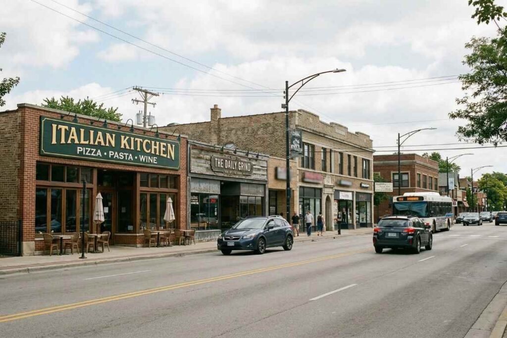
Retail environments are particularly unforgiving. A clothing boutique on a busy commercial street might have a twelve-second window to capture a shopper’s attention as they walk past. If the sign doesn’t register in that window — if it’s competing with larger, brighter neighbors and losing — the business might as well not have exterior signage at all.
What Undersized Signage Actually Costs
The financial consequences are rarely attributed to the sign, and that’s partly why the problem persists. When a new restaurant underperforms in its first six months, the owner examines the menu, the pricing, the staffing, the reviews. The eight-hundred-dollar sign hanging above the door doesn’t enter the conversation.
But the wrong sign size is often the first point of failure. It’s the instrument doing the work before a customer has ever tasted the food or read a review. A restaurant that seats sixty people and runs lunch and dinner service loses real revenue every single day that its exterior doesn’t convert passersby into walk-ins.
One observation from operators who’ve been through a signage upgrade: they frequently describe the change as feeling like a soft opening all over again. The volume of “we didn’t know you were here” comments from new customers is, for many of them, a slow-burning embarrassment. The discovery that people had been walking past for months without noticing is not abstract — it shows up in the numbers the moment visibility improves.
The Modern Signage Calculation
Illuminated signage changes the math in a few ways, and not only for the obvious reasons. Backlit and edge-lit formats tend to read well at greater distances and hold legibility in adverse lighting conditions — overcast days, dusk, heavy rain. This has less to do with brightness and more to do with contrast: a sign that creates its own contrast against a background doesn’t depend on ambient light to be visible.
LED-based formats in particular have pushed down the cost barrier to the point where luminous signage is accessible to small operators, not just national chains. If you’re working through the specifications for the first time, something like this guide on how to pick the right size for your custom LED neon sign is the kind of practical resource that addresses viewing distance and environment in a way that general design advice often doesn’t.
Size still matters in illuminated formats, incidentally. A small glowing sign is still a small sign. The light doesn’t compensate for insufficient surface area — it just makes the undersized sign visible after dark instead of invisible all day.
The Underestimation Bias
There’s a psychological component worth naming. Most people, when they imagine a wrong sign size on a building they’re responsible for, default to something modest. There’s a discomfort with being too big, too loud, too conspicuous. This is understandable — nobody wants to be the garish storefront neighbors complain about.
But most commercial signage that fails in practice fails quietly, not loudly. The oversized sign is rare. The undersized one, the one that got approved because it looked tasteful on screen, is everywhere.
The correction isn’t to go as large as possible. It’s to start the sizing decision from the viewing environment outward — how far away is the primary audience, how fast are they moving, what else are they looking at — and work backwards to what legibility actually requires. That calculation often lands somewhere considerably larger than the first instinct.
Signage is infrastructure. It doesn’t feel that way because it doesn’t move, doesn’t require maintenance on a daily basis, and doesn’t come with dashboards showing performance. But it’s doing something essential every single hour the business is open, and often for hours when it isn’t. Getting that calculation wrong is one of the quieter, costlier mistakes an operator can make — and almost nobody talks about it until after they’ve already made it.